For the complete documentation index, see llms.txt. This page is also available as Markdown.

Custom CSS

With custom CSS, you can adjust the software’s appearance without modifying the source code, making the interface more to your liking—for example, changing fonts, tweaking the theme color, or adjusting the chat bubble background.

Where to set it

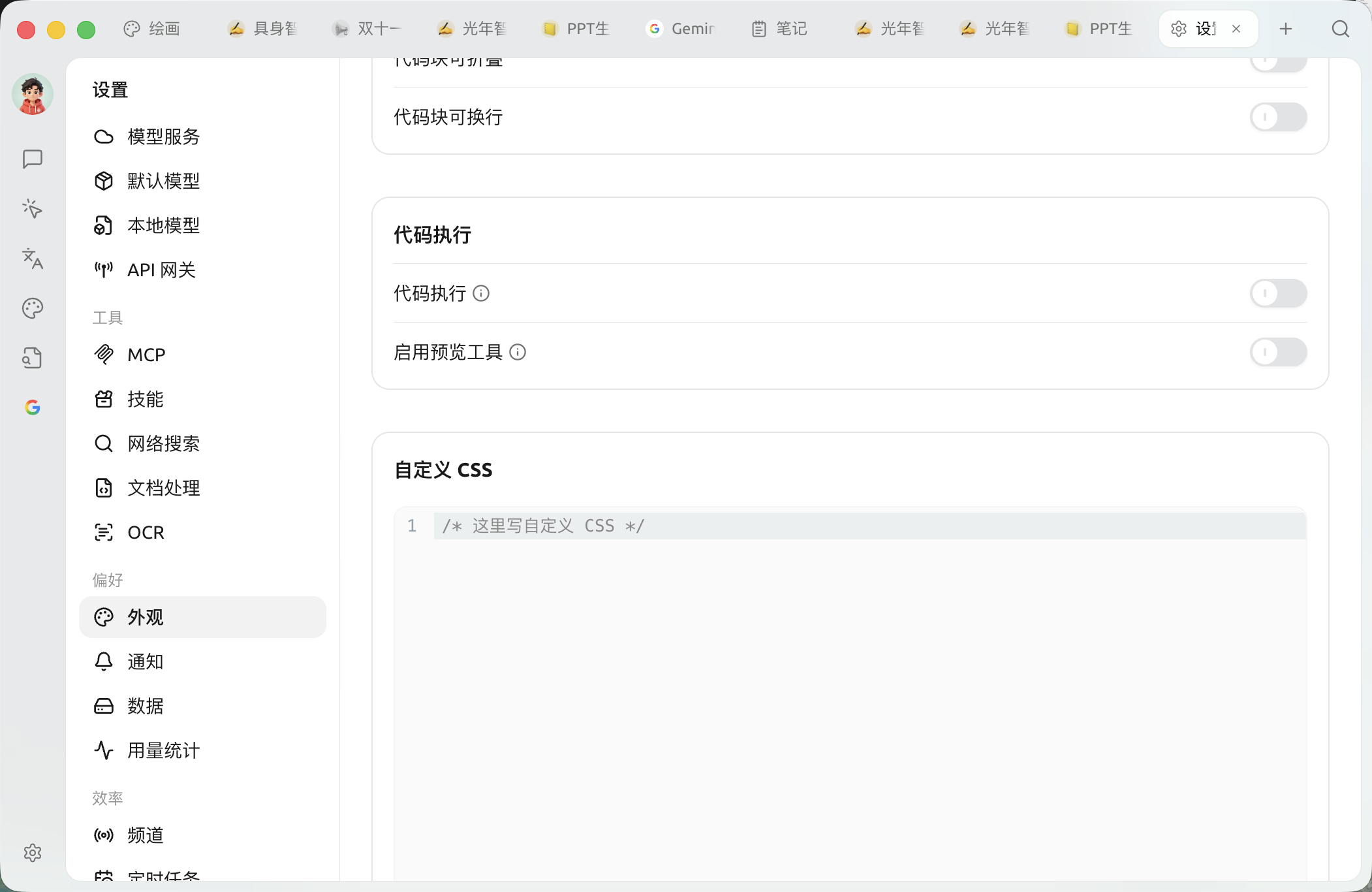
After enabling it 【Settings】→【Appearance】at the bottom of the page, find "Custom CSS" code box, and enter your styles there to take effect in real time. If left blank, no custom styles will be loaded.

the "Custom CSS" code box at the bottom of the 【Settings】→【Appearance】 page

The CSS you enter will be injected as-is into each window's <head> corresponding to a <style id="user-defined-custom-css"> element. Since it does not belong to the software’s internal style layer (cascade layer), your styles have higher priority than the built-in styles under the same selector, so most ordinary declarations do not need !important to override them and take effect.

An example that works

The following uses only variables and selectors that actually exist in the software:

About theme variables

The software uses a set of CSS custom properties (variables) to describe its color scheme. The default values for the light theme are defined on :root , and the override values for the dark theme are defined on .dark —when switching to dark theme, the root element will be given the .dark class. So to distinguish between light and dark, write them separately under the :root and .dark selector instead of using the old theme-mode attribute selector.

Common public variables include:

Variable
Meaning

--background / --foreground

Main background color / main foreground (text) color

--primary / --primary-foreground

Theme color / text color on the theme color

--card / --popover

Card and popover background colors

--muted / --muted-foreground

Muted background / muted text color

--border / --input / --ring

Border, input field, and focus outline color

--sidebar series

Sidebar-related colors

--chat-user

User message bubble background color

--link

Link color

--code-block / --inline-code

Code block / inline code background color

--font-family / --code-font-family

Global font / code font

--radius

Base radius value

For the complete list of variables and default values, refer to the source code:

Tips for pasting an old stylesheet

If you paste a stylesheet written for an older version and incompatible with the current interface, the software may automatically disable it and show a tip in the Custom CSS area. In that case, first adapt the styles to the current variables and selectors, then delete the marker on the first line as prompted to re-enable it.

Cherry Studio theme gallery: https://github.com/boilcy/cherrycss

Share some Chinese-style Cherry Studio theme skins: https://linux.do/t/topic/325119/129


💡 Get help and submit feedback

If you encounter any questions or bugs during configuration or use, or have suggestions for feature improvements, please refer to the official channels provided in Feedback and Suggestions .

Last updated

Was this helpful?